The GUISkin Method
When creating Unity editor windows with toolbars, you may have seen there are a couple of different ways to work with toolbar styles. Many of the examples available online or in asset store packages create styles in code which certainly works. However, I haven’t seen many examples using GUISkin to create a GUI in the editor so I thought I’d share what I’ve learned experimenting with this method myself.
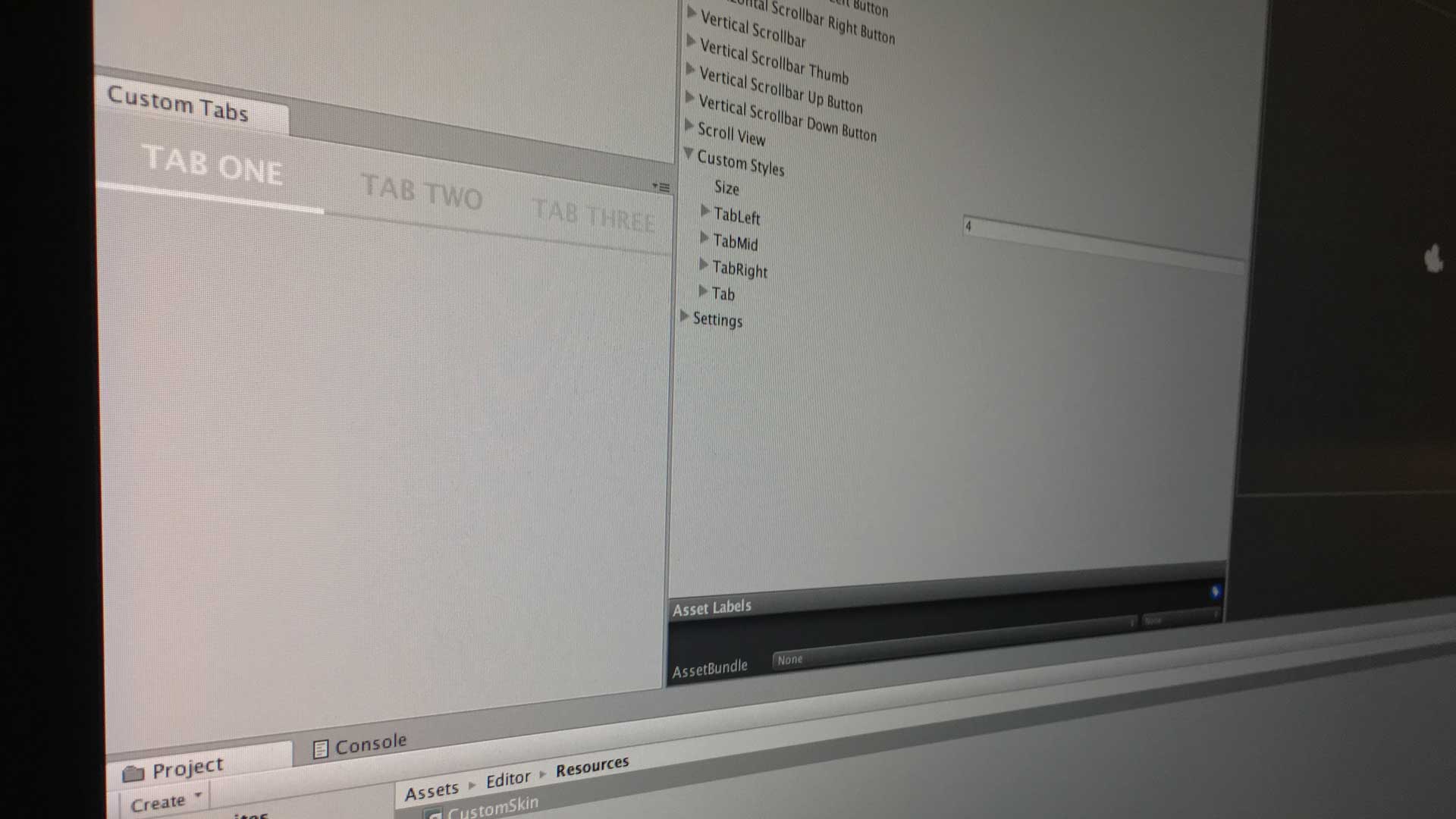
To demonstrate what you can do with only a few lines of code, I’ve put together a sample editor window with a ‘flat design’ tab bar inspired by Google’s Material Design as shown below:
If you look closely, you’ll notice the color of the font for each tab gets lighter as you go from left to right. This isn’t part of Material Design but was done to demonstrate how you can control the style of each tab button individually.
Creating a Custom GUISkin
The first step in creating this tab bar style is to create a custom GUISkin. This is a built-in resource type in Unity. To create one, click the Create menu in the Project window and select GUI Skin.
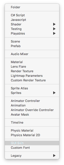
Give it a name, I choose ‘CustomSkin’ in this example which the code will reference later. Click on the CustomSkin to view it’s inspector.
Defining a Toolbar GUI Style
Next we’ll define the custom styles for the toolbar buttons. In the Inspector window, go to the Custom Styles item and expand it. Change the value of ‘Size’ to 4. Enter the following names for each of the new styles:
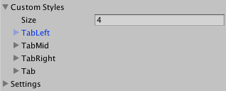
- TabLeft
- TabMid
- TabRight
- Tab
The ‘Tab’ style alone could be used as your style for all the toolbar buttons. However, in our example we want to control each of the 3 tabs individually so we created styles with the same name ending with Left, Middle, and Right. This is how we can control the text color of each tab to get that effect where the tabs fade towards the background from left to right.
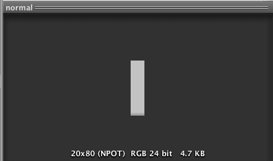
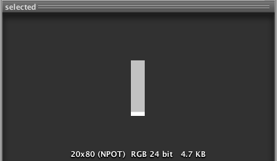
I then created two simple images for the tab backgrounds, a normal and selected state as shown here:
For each style, we’re going to set up the Normal and On Normal (selected) states. Here is how I set up TabLeft. I used the same settings for TabMid and TabRight with the exception of the Normal Text Color which I made slightly lighter for the TabMid and lighter still for TabRight.
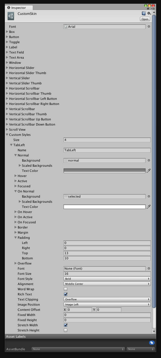
Inspector showing TabLeft GUIStyle settings
Implementing Our Editor Window
Lastly, we’ll write the script behind the EditorWindow to tie it all together.
using UnityEngine;
using UnityEditor;

public class GUISkinWindow : EditorWindow
{
    private static GUISkinWindow _windowInstance;
    private GUISkin skin;
    private GUIStyle tabStyle;
    private int selectedTab = 0;

    private void OnEnable()
    {
        // save references to skin and style
        skin = (GUISkin) Resources.Load("CustomSkin");
        tabStyle = skin.GetStyle("Tab");
    }

    public static void ShowWindow()
    {
        _windowInstance = (GUISkinWindow)EditorWindow.GetWindow(
            typeof(GUISkinWindow));
        _windowInstance.titleContent = new GUIContent("Custom Tabs");
    }

    private void OnGUI()
    {
        GUI.skin = skin; // use our custom skin

        // Create toolbar using custom tab style
        string[] tabs = {"TAB ONE", "TAB TWO", "TAB THREE"};
        selectedTab = GUILayout.Toolbar(selectedTab, tabs, tabStyle);
    }
}
In OnEnable() we load the CustomSkin we created above and get a reference to the “Tab” style. You’ll notice I didn’t do anything with the “Tab” style earlier. However, in OnGUI() we pass this style to the GUILayout.Toolbar() method to create our toolbar.
The way this works is if you define styles as we have with the same name ending with “Left”, “Mid”, “Right” it will use those styles instead. That’s why I created the “Tab” style in addition to the ones we configured. This behavior isn’t the most obvious but easy to use once you’re familiar with how it works.
The rest of the code just deals with displaying the window and keeping track of the currently selected tab.
While the above is easy enough to do in code entirely, there are some advantages to doing this using styles in a GUISkin. When coming up with the colors and other style elements, you can easily make changes to the GUISkin and see your toolbar change instantly without having to recompile for example. If you’re already using a custom GUISkin then this approach may make sense for you.
I hope you found this GUI scripting post helpful and if you’ve found any other uses for it or interesting variations on this method, let me know in the comments below.

Very cool